|
|
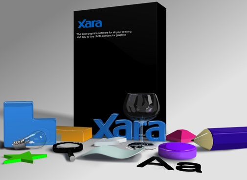
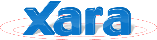
» Index The Outsider's Featured Tutorials are selected from a variety of sources included the best tutorials from the impressive archive on The Xara Xone (created by Gary Priester), Guest Tutorials submitted by Xara enthusiasts and new material created by Xara. This month's Outsider theme is creating 3D artwork, so this step-by-step tutorial is from José Campoy, who created this amazing 3D screen entirely in Xara Xtreme. He's very cleverly created 3D objects representing the main tools in Xara Xtreme. Obviously to create images of this quality you need some perseverance, not to say considerable talent, to create original artwork like this. But below he shows you the basic principles for creating pseudo 3D images in Xara Xtreme, by re-creating the Xara logo. Shiny Text by José CampoyIn this month's tutorial we will create some shiny text in Xara Xtreme, similar to the Xara logo in this image.
If you follow this tutorial you will learn how to make your own shiny text or logo in just a few minutes. Yes, I really do mean minutes! STEP 1: Start with the object or word you want to make a 3D version of, I'm going with the Xara logo.
STEP 2: Next, we have to clone the text (Ctrl+k) and move the clone up and to the right. You can use the arrow keys on the keyboard. You'll find it easier if you change the clone color, for example, to the green I have used here. Next, select the cloned version and move it to the back (Ctrl + Shift + B).
STEP 3: Select the cloned text and join the shapes. With the shapes selected go to Arrange>Combine shapes>Add shapes (Ctrl + 1). Now we need to add some nodes to the joined shape. You can add more nodes to a shape with the shape editor tool (F4). Just one click on the edge of the shape and a new node will be in place. This creates a good perspective.
STEP 4: With the shape editor tool selected you can select and drag the nodes. Move the new nodes to the closest node in the original logo, as seen in the example. For an easier drag and drop, select snap to objects (the magnet icon on the top icon bar).
STEP 5: Before we move on you should review your perspective. Sometimes it’s OK to use the same values in each letter, but sometimes a letter or a shape may need some tweaking to be more accurate. In this case the "X" letter looks different than the others. This is easy to fix. I’ve just moved the nodes to the left or up a bit. Use your own judgement but try not to add new nodes. In my example I’ve moved just 4 nodes and now I feel that we have a better perspective.
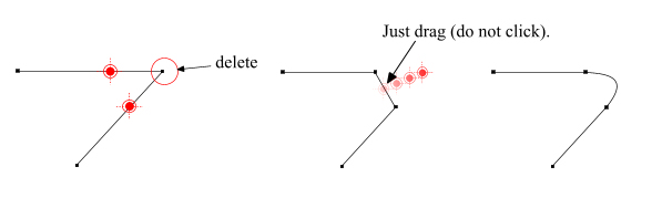
STEP 6: This step is optional, but I recommend you make the corners of cloned Shape (the perspective) rounded for a better looking image. To do so, with the shape editor tool selected you need to add two new nodes close to the corners and delete the node in the corner. Then drag the line between the two new nodes. It's important to not add new nodes. Just drag the line from the center.
STEP 7: Now we will start the best part! First, fill the shapes with a flat fill color (I recommend you use linked colors) and change the line color to a diferent color, (I've used red). If you cannot see the line change the line width.
STEP 8: Next, clone the original shape (Ctrl + K), and remove the color fill of the new shape, make the line width bigger (in this case I’ve used 8 pix).
STEP 9: Now, with the new shape selected (the shape with the biggest line) change the line color to white and add a flat transparency of 60% or more (I have used 77%) and feather it (this value depends of the image size, I have used 3 pix but it will be different for every image). Now you have the base.
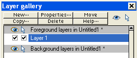
STEP 10: Make a new layer
and create a shape on the new layer over the text, using the freehand tool.
STEP 11: Clone the original shape (Ctrl + K) and intersect with the new shape, with the selector tool (space v) select the large shape and the cloned original logo. Now go to Arrange>Combine shapes/Intersect shapes. We now have a new shape as a result of combining our shapes.
STEP 12: With the combined shape still selected, color it white, and make it mostly transparent to create a subtle reflection. In this example I’ve added a slight fading transparency from about 85% transparent at the bottom to almost entirely transparent at the top.
STEP 13: Make a new layer and create some new shapes over the perspective - you don’t need to worry about getting a perfect fit, they just need to be over the perspective.
STEP 14: Change the color of the new shapes to black, add transparency and feather.
STEP 15: Now, let´s make it shiny! We do this by adding reflections along the edges. First, create some new lines using the freehand tool along the front edge of the original shape.
STEP 16: Change the color of the lines to white, and then in the freehand & brush tool choose a suitable brush type - you can experiment with different ones, but I have chosen the ‘ellipse’ brush shape, because this brush is bigger in the center and is rounded towards the edges.
STEP 17: Next, add transparency to some of the lines.
STEP 18:
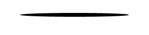
Now we just need to add a shadow to our text. I’m going to add two types of shadow, firstly a cast shadowing
using the shadow tool and then also a general very soft elliptical shadow under the whole object.
STEP 19: Now with the both elipses selected give them a black fill, a large amount of transparency and feathering. The inner shape should be on top to make the center more dark. Finally send both to back (Ctrl+B) so they are behind the graphics.
STEP 20: Add a background. Now we have finished our shiny text.
You can continue adding more shapes for a better image but I hope that I've successfully demonstrated the principle. I’m including another example at the bottom of this tutorial that used a similar technique, though with more shapes added - you can download this file and see it for yourself here.
Easy? Of course, it was made with Xara Xtreme! Now, try it yourself and don’t forget to post your shiny text or logo on TalkGraphics.com
|